Why are your wedding colors so important?
Your wedding vision will come to life if everyone working with you understands the overall look you want to achieve. Picking your wedding colors (color scheme or color palette) is one of the first steps in the process of planning your wedding. It is actually a fun and easy process.
The wedding palette you select will impact everything about your wedding, including:
- flowers for the bridal bouquet and other floral arrangements
- color of the bridesmaid dresses
- the color of bowtie/tie/handkerchief for the groom and groomsmen
- wedding invitations and stationery
- linens for reception table
- color of the wedding cake or desserts
You will want to share your color palette with everyone in your wedding party and on your vendor team. Your palette will guide everyone who is working on your wedding to know exactly the colors and hues that you love. There will be no ambiguity about what you mean by “plum” “burgundy” or “blue.” Just like looking at colors of paint, any color can have many variations and tones. When everyone is on the same page about your color palette, they can work together to bring your vision to life.
Tips for choosing your wedding color palette
If you aren’t exactly sure where to start, here are a few considerations that might impact your choice in wedding colors.
-
Season
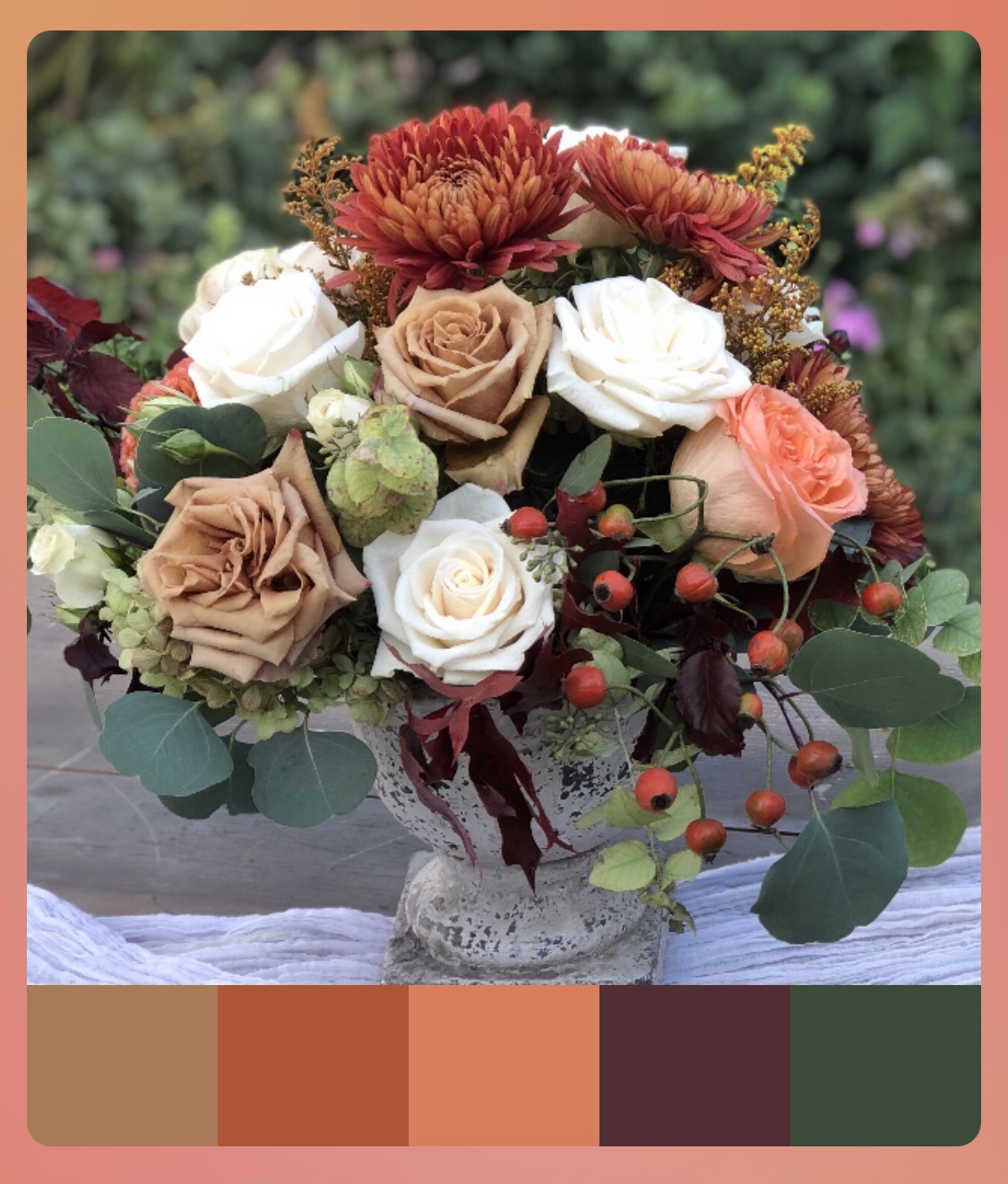
The season of your wedding might impact your choice in colors. For example, a fall wedding will have more golden, burnt orange and brown tones. A spring wedding will generally have more pastel colors spring. A summer wedding often have more bright intense colors of hot pink, yellow, purple, or red. Winter weddings tend to have dark and moody colors, but the options are endless.
Photo credit: The Garden Studio
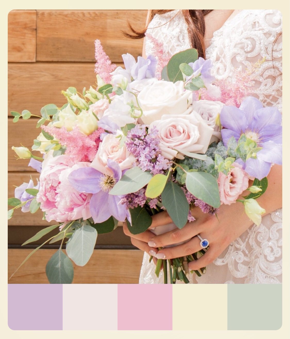
Spring Pastel Wedding Palette
Photo credit: McAleese Photography
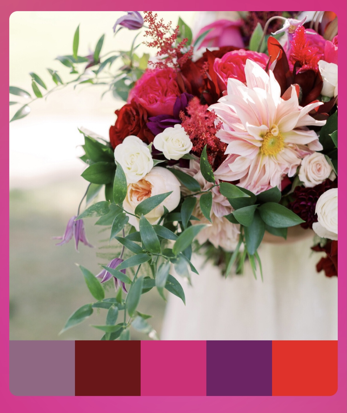
Summer Wedding Palette in Jewel Tones
Photo credit: Molly Lichten
-
Holidays
Holiday celebrations can impact the color theme of the wedding. For example, a Halloween wedding can include pumpkins, seasonal flowers with bright orange, and other complimentary autumn colors. A Valentine’s Day wedding would classically include a range of reds and pinks. A Christmas themed wedding might include silver or gold highlights. See the photos below for inspiration:
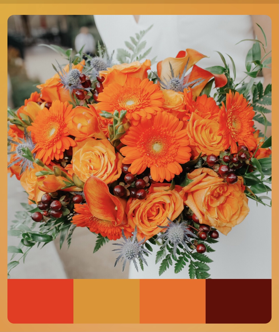
Halloween Wedding Palette
Photo credit: Cedar and Lime Collective
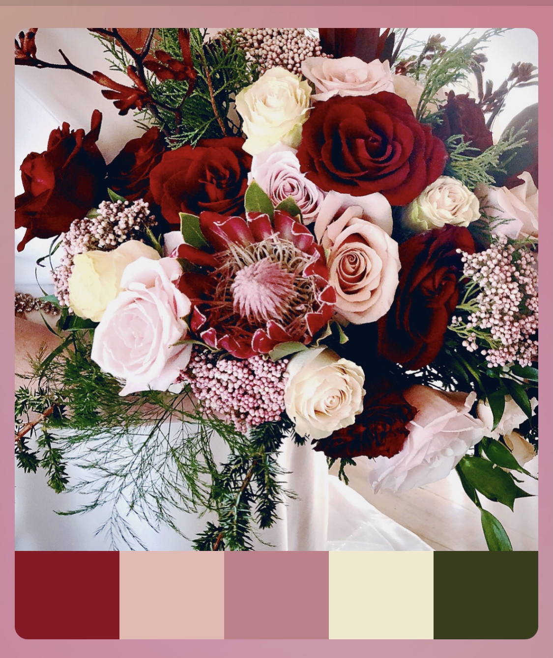
Valentine’s Day Wedding Palette
Photo credit: The Garden Studio
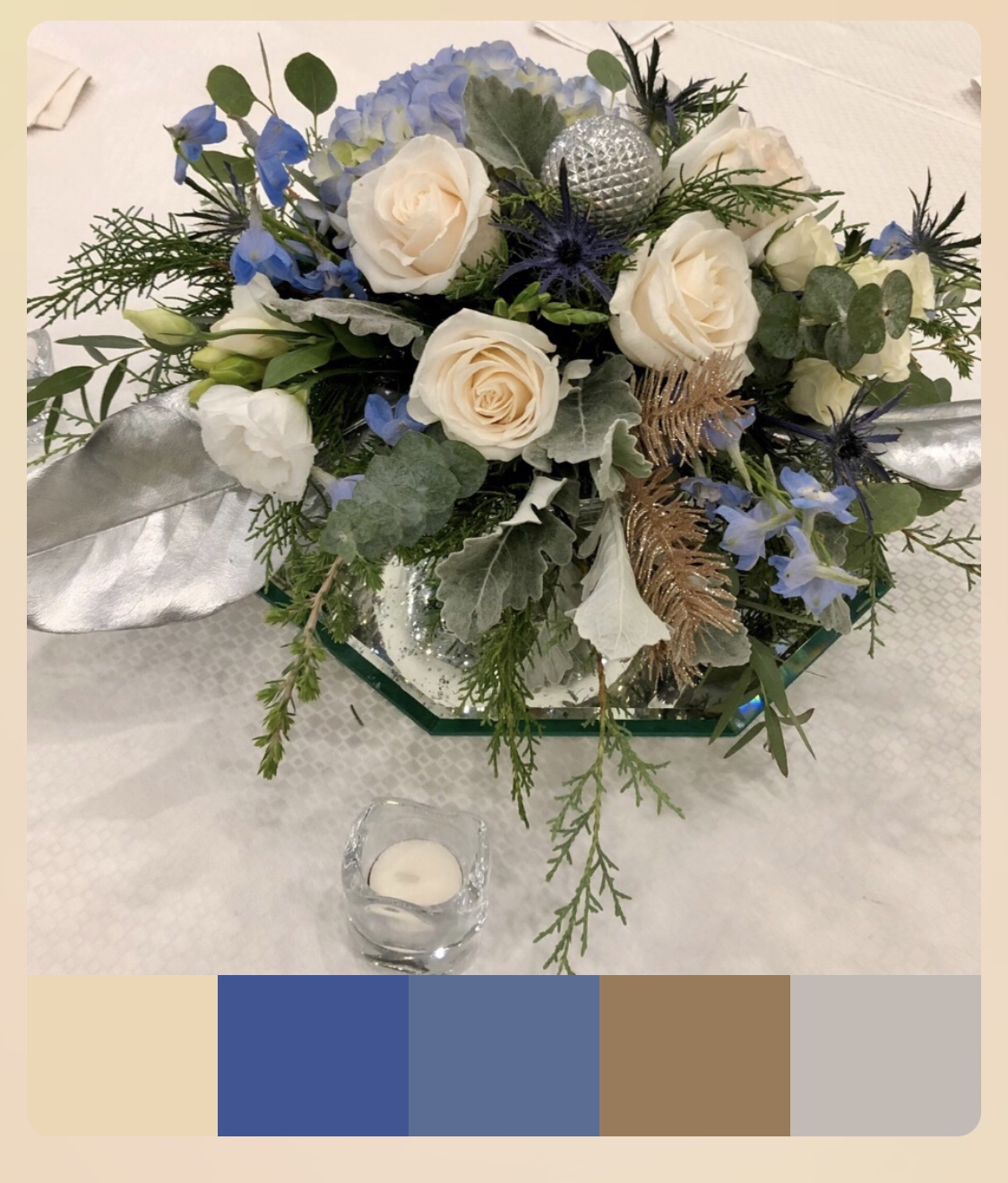
Christmas Theme Color Palette
Photo Credit: The Garden Studio
-
Culture
I have designed for weddings that reflect different cultures and ethnicities. An East Asian-Indian wedding might include bright tropical colors including red, hot pink, orange and fuchsia. In some cultures, certain colors are preferred and others are to be avoided. For example, Chinese prefer not to use red in a wedding, as red is traditionally used for funerals.
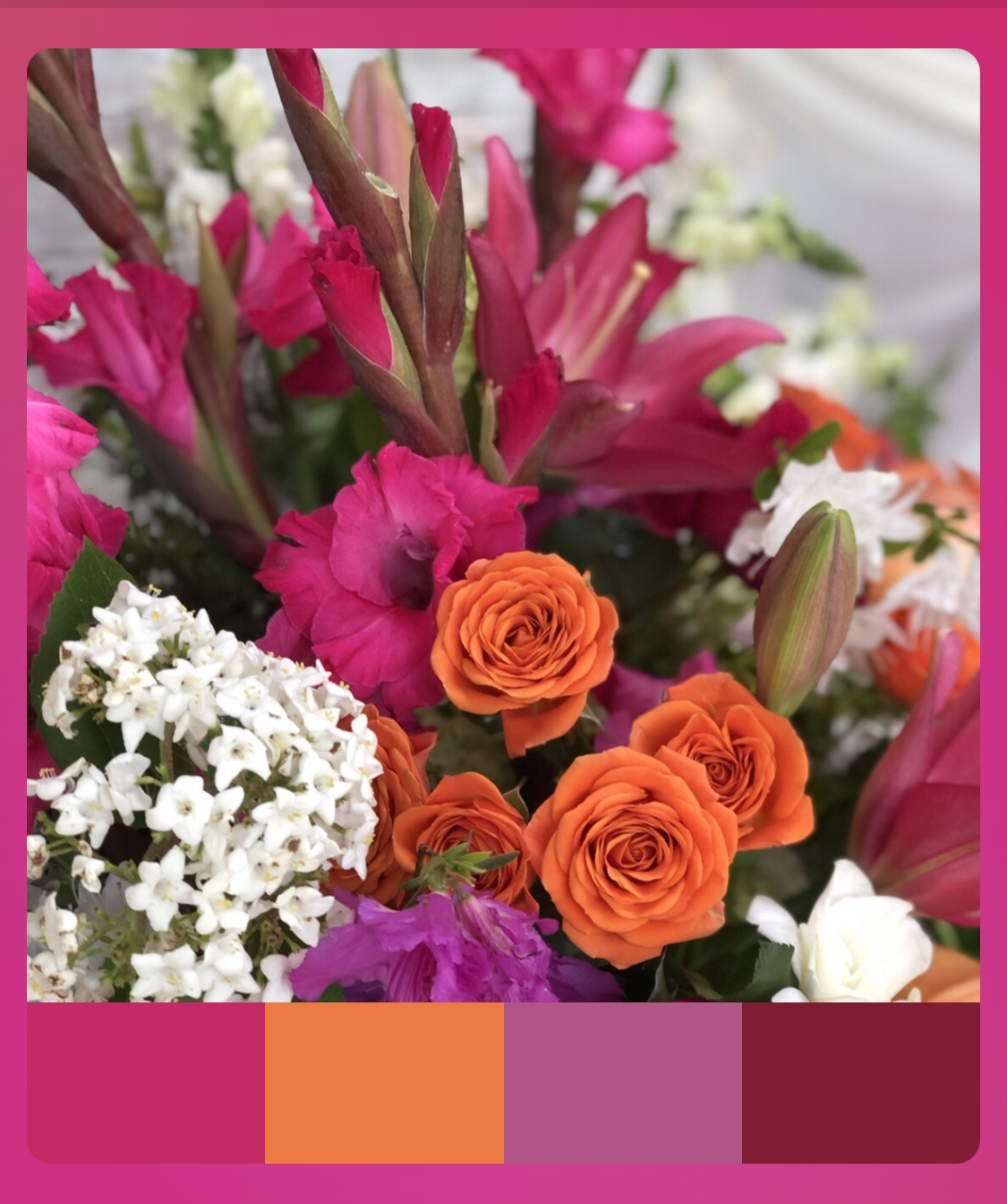
East Indian Wedding Color Palette
Photo credit: The Garden Studio
- A Favorite Color or Favorite Flower
Sometimes the entire wedding color palette can revolve around a favorite color such as bright blue. Other times a wedding color theme can be focused on a favorite type of flower, like a burgundy and blush king protea or a brown pheasant feather. Your floral designer will want to know all your favorite colors to include in the wedding palette, as well as your favorite flowers and accent décor.
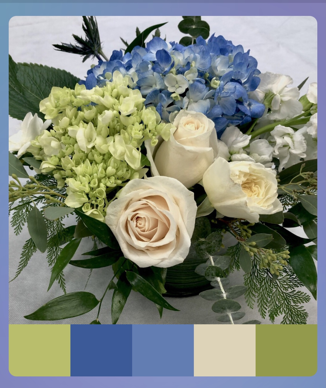
Blue is the Bride’s Favorite Color
Photo credit: The Garden Studio
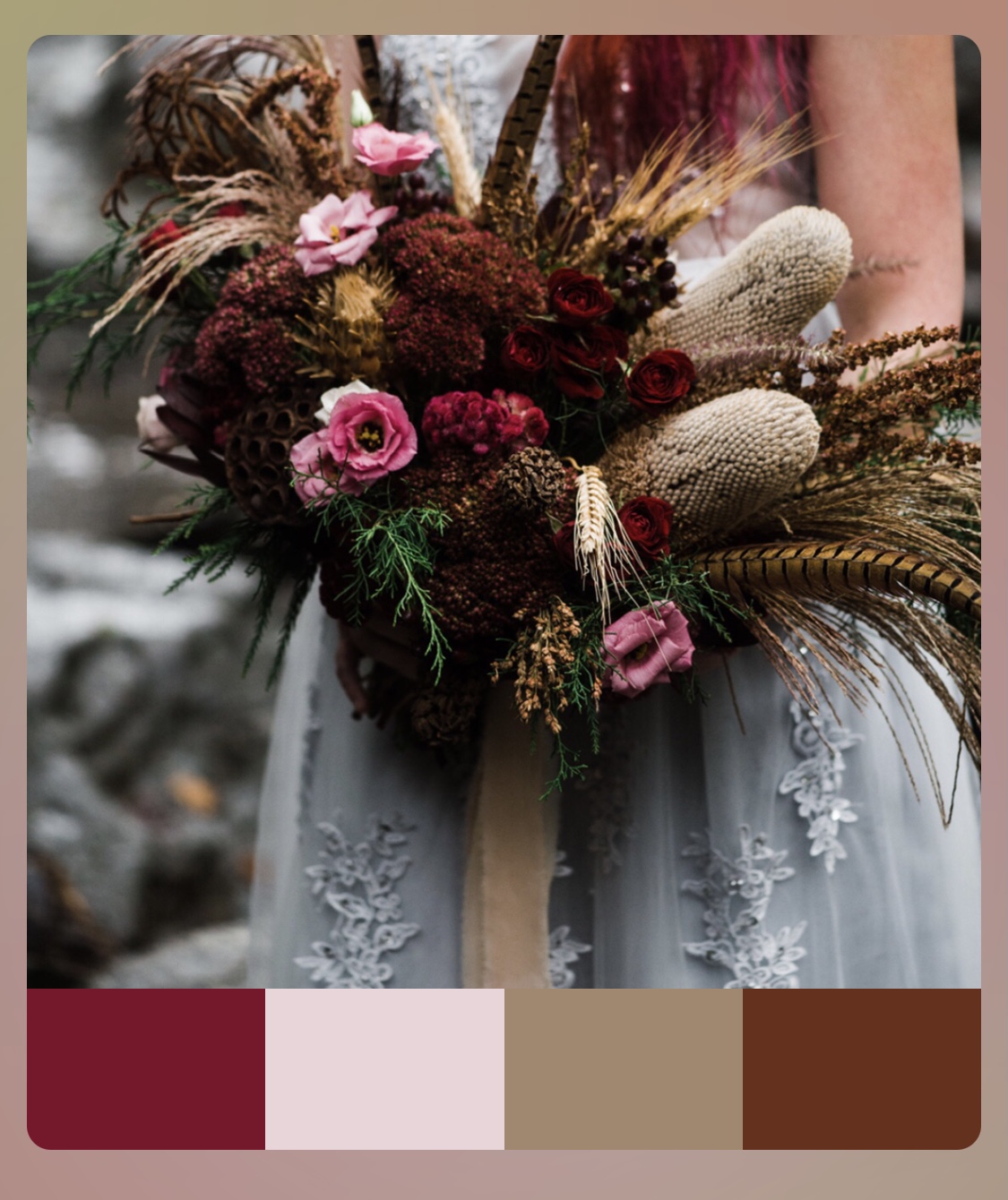
Pheasant Feathers Set the Color Palette
Photo credit: Lock and Company
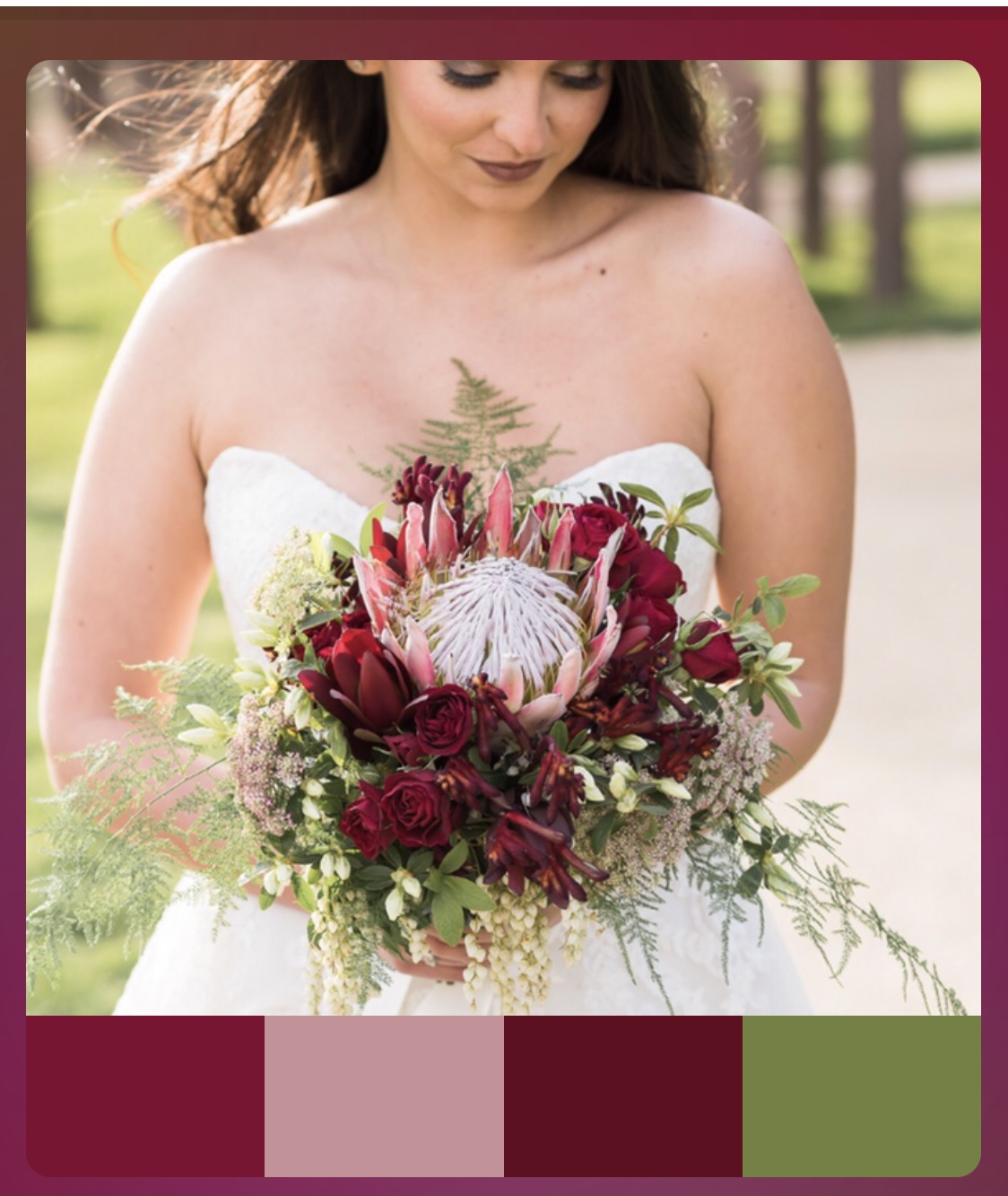
A Favorite Focal Flower (King Protea) Guides the Wedding Color Palette
Easy 2-Step Process for Creating a Color Palette
Step 1 – Find inspiration photos
Once you have an idea the key colors, seasons or flowers you’d like to use in your wedding, Pinterest is your friend. You can find so many inspiration photos by simply searching the category (e.g. fall wedding flowers). There are thousands and thousands of wedding color palettes, wedding bouquets, bridal parties, and mood boards in Pinterest. You can search by any category imaginable. Find just a few inspiration photos that makes your heart sing. Use these images to begin to shape your wedding vision. Save all your favorite inspiration photos to your camera roll.
Step 2 – Create a palette board
There are many apps that can help you develop a color palette from your favorite inspiration photo, so feel free to explore the many options. My favorite app is Palette Cam. It is a free app that is extremely user-friendly and intuitive, and it is easy to use on your iphone or android.

Palette Cam
Here are the easy steps for using the Palette Cam:
- Open the Palette Cam
- Click on the photo icon on the top left corner or ‘photos’ on the bottom left (see image below)
- Upload a copy of your favorite inspiration photo from your camera roll
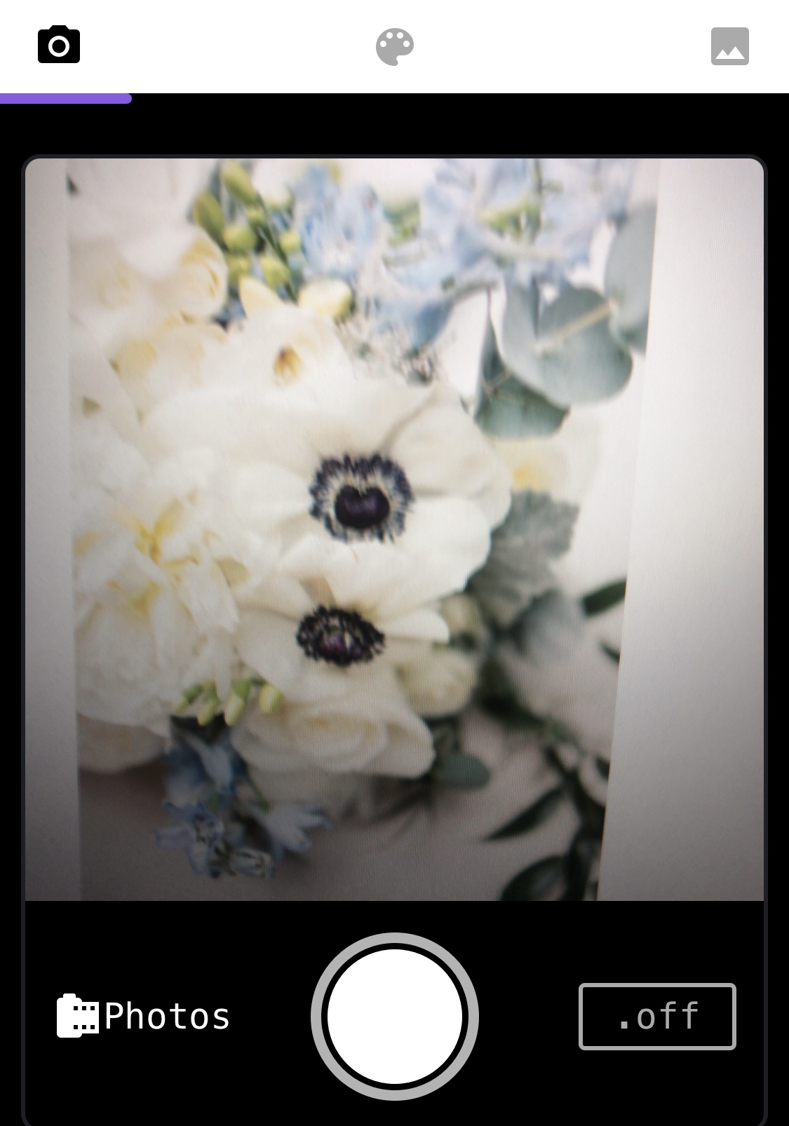
Downloading a photo
Once you have selected a photo, move the target icon anywhere on the photo to select a color for your palette (see image below). Once you have captured the target color, tap the circle in the bottom center. Your selected color is automatically added to your palette. Keep identifying colors until you have four or five colors from the photo for your palette.
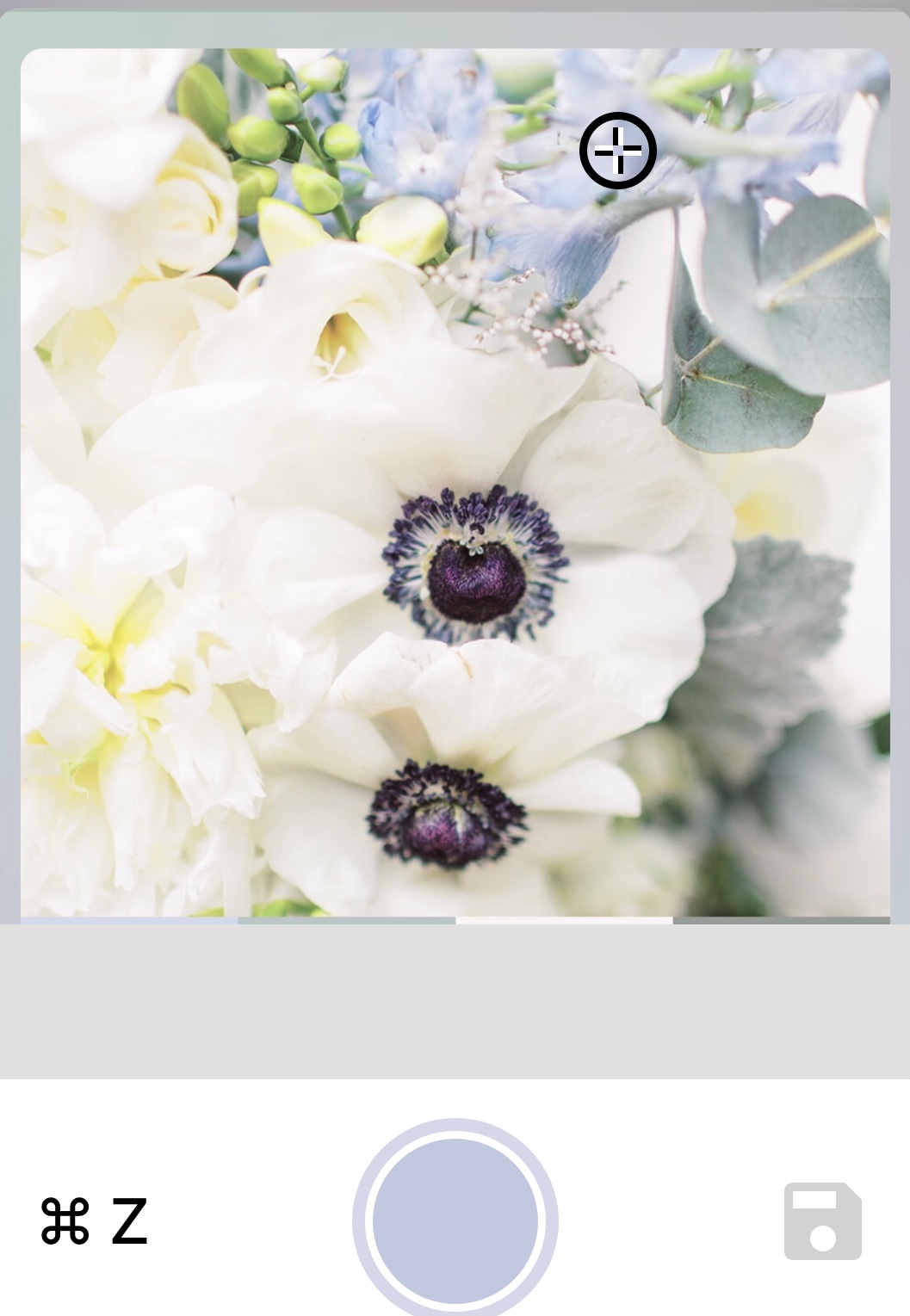
Selecting key colors for the palette
After you have selected the key colors you would like to include in the palette, tap the save disk (on the lower right bottom). The full color palette will appear in a new screen. Then you can simply tap your palette to see it with the photo.
Your wedding palette is easily generated by the app and can be saved by capturing a screenshot. See the example below:
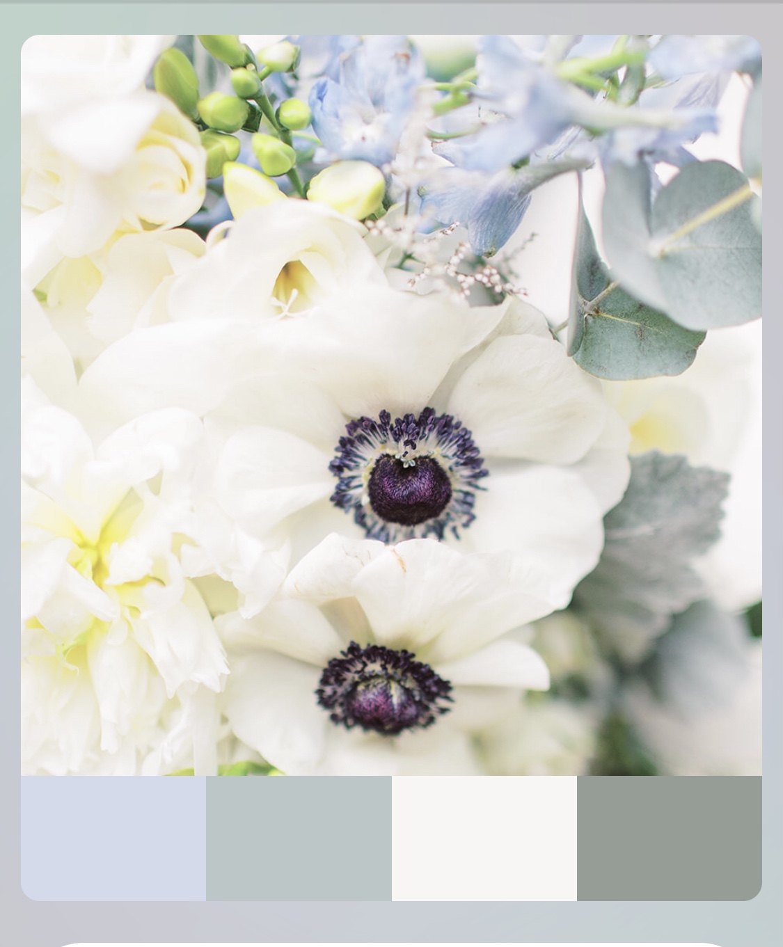
Inspiration photo with color palette
Your wedding flowers are based on the color theme
As a wedding floral designer, one of the first things I ask when consulting with a couple, is “What are the colors they would like for their wedding.” These colors will influence all the recommendations for flowers and greenery right from the start. The season may impact the flower choices that are available in a particular color in the palette. For example, pale pink or blush peonies will be available in spring, but not in the fall. Instead, I might recommend pale pink dahlias for a fall wedding.
Different types of flowers in the selected color palette are recommended for bouquets, boutonnieres, corsages, as well as all the ceremony and reception arrangements. When a particular flower that was originally planned isn’t available or isn’t a good quality, I rely on the color palette to find alternative flowers that work well in the color theme.
Below are wedding photos that were based on the dusty blue and white color theme illustrated in the palette created above (photo credits: Rebecca Wilcher)
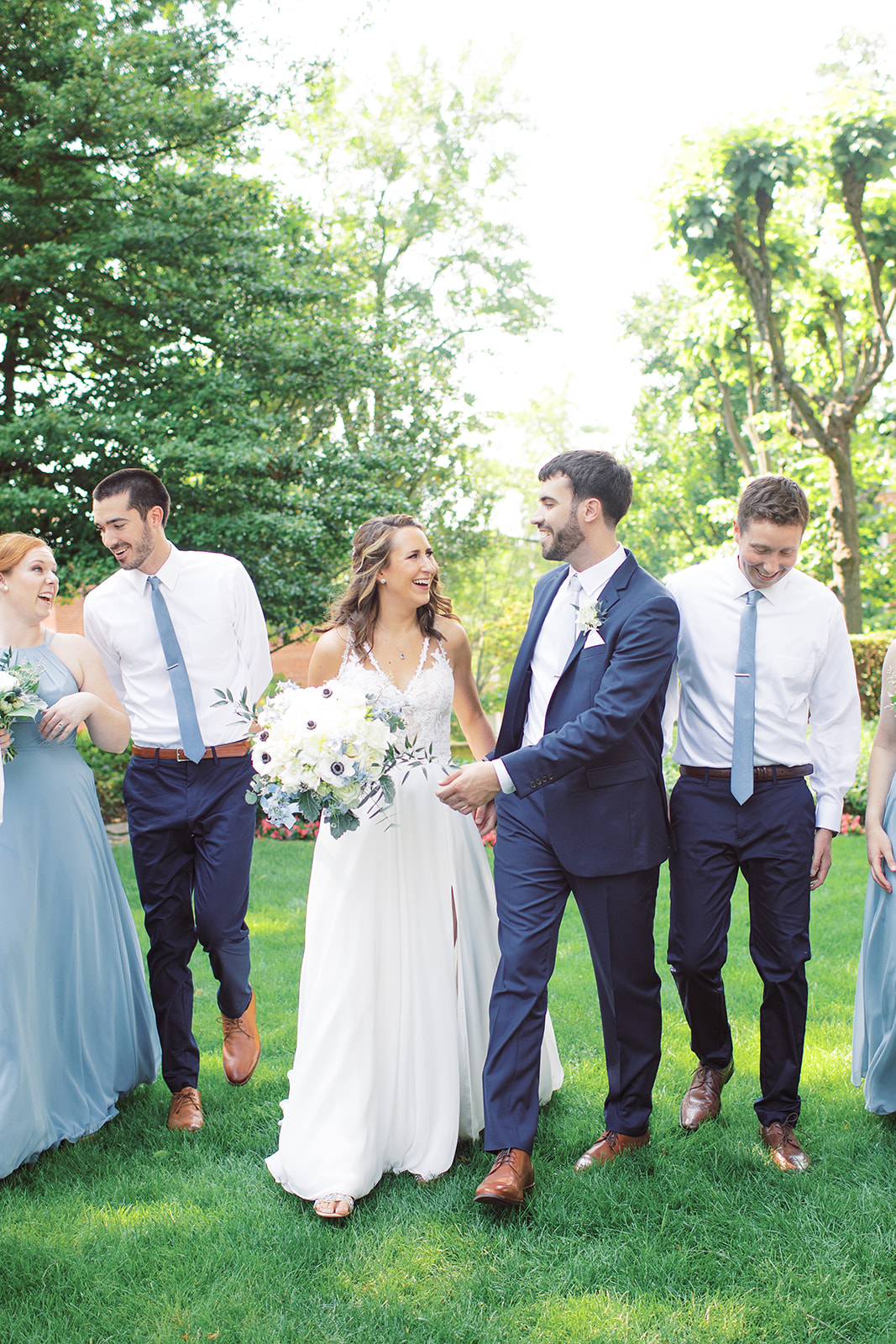
Wedding Party in Blue and White Theme
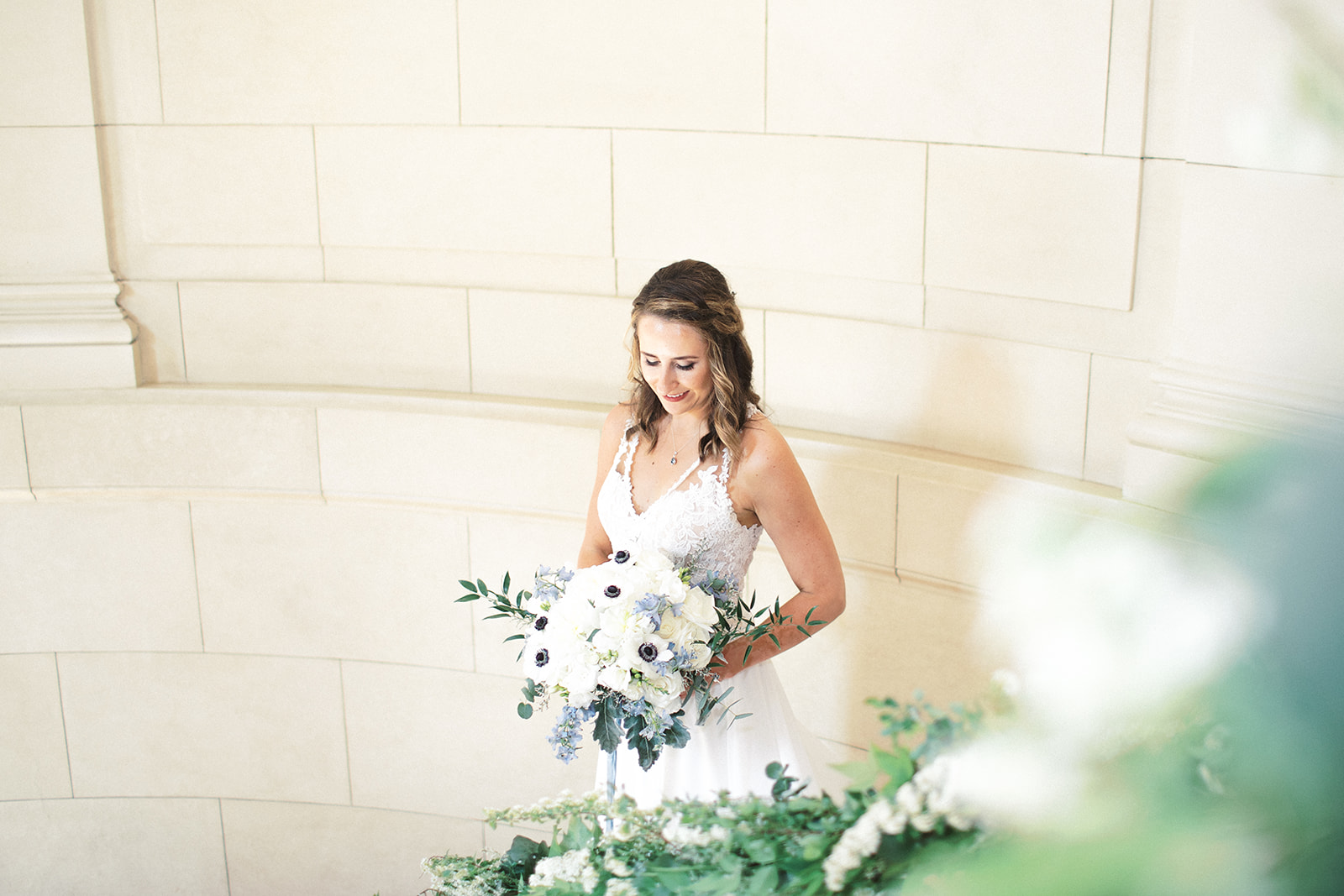
Wedding Bouquet with Color Theme
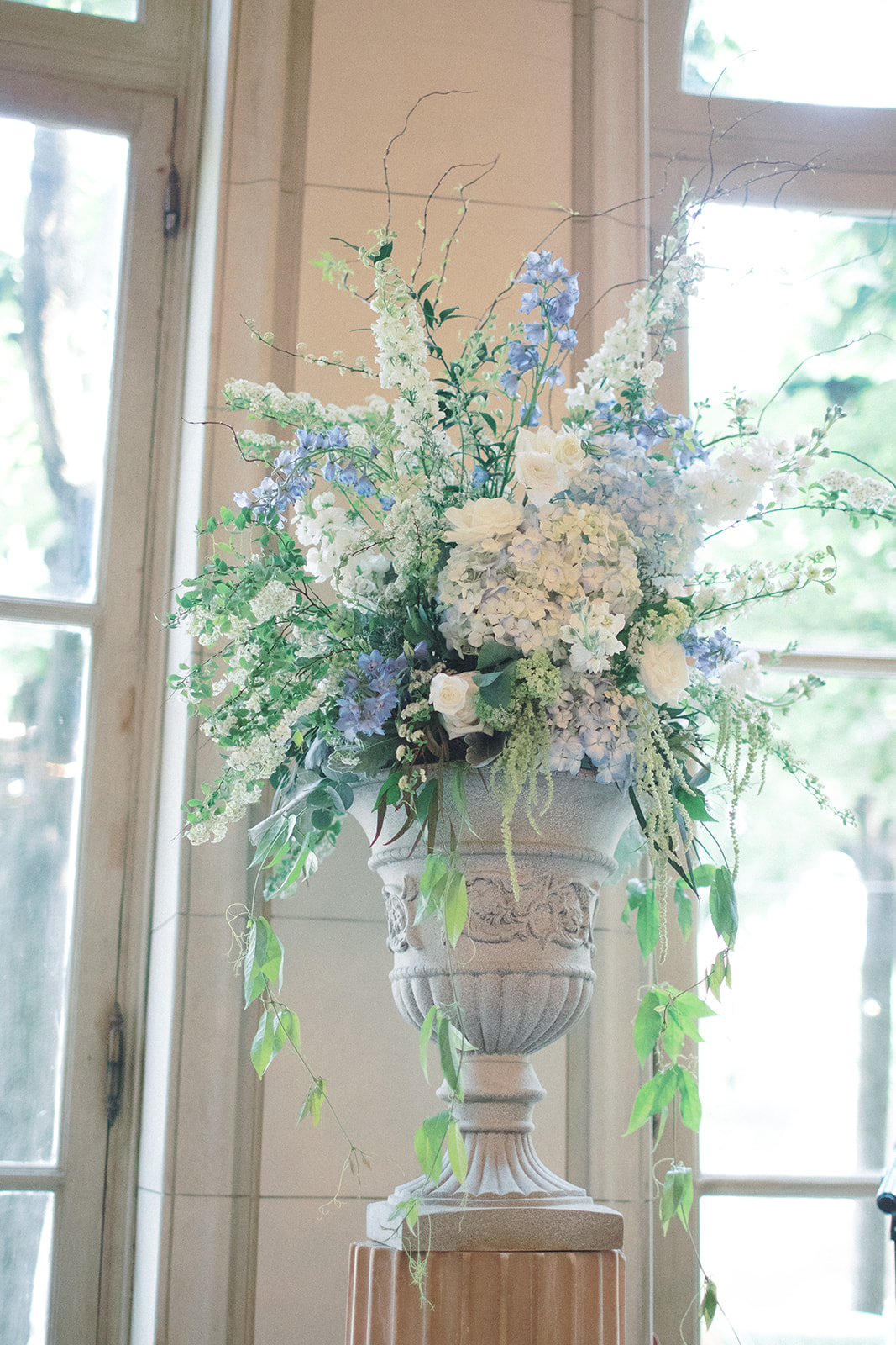
Blue and White Ceremony Arrangement
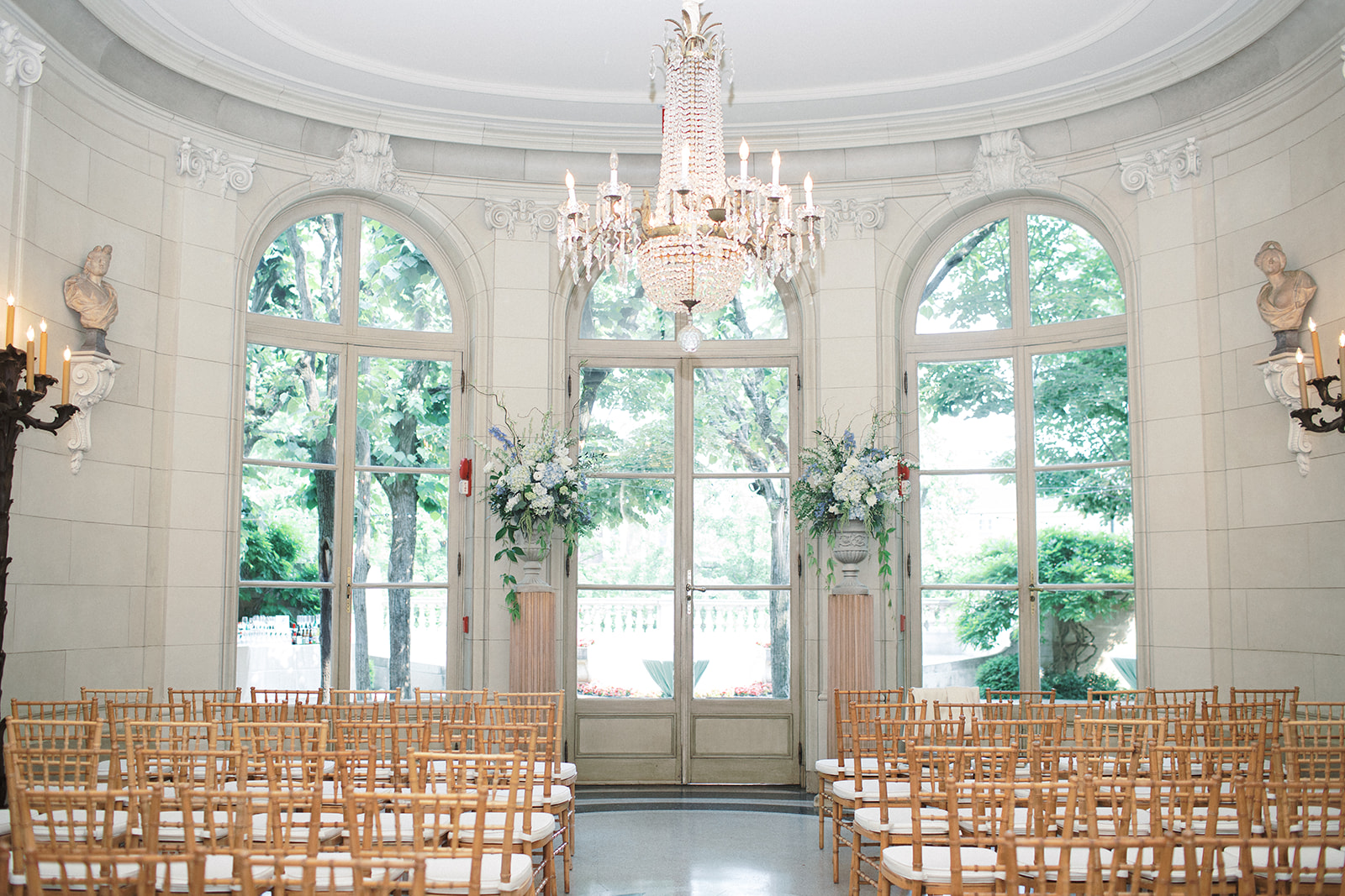
Blue and White Ceremony Arrangements Displayed at the Meridian House, Washington, DC
